
Hey there, 3D Flip Card is a good feature of a website. In this blog, we’ll learn how to create a 3D Flip Card Effect On Hover Using Only HTML & CSS.
We can use the backface-visibility of CSS property in combination with the transform functions to make a flipping and revolving effect without using any JavaScript.
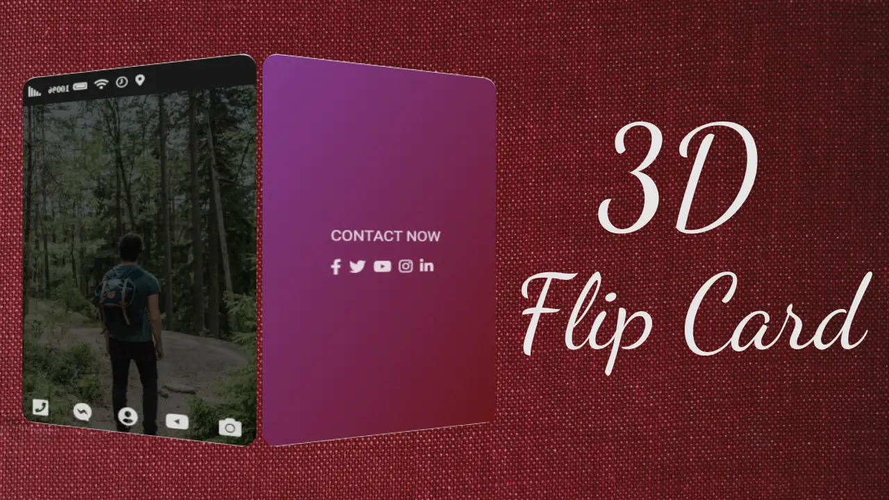
In this tutorial there are two images, one is the front side and the other is the back side of the card. The front side of the card is placed over the back side and to achieve that we used the CSS positioning method, so that only one side of the card is visible at the beginning.
When you put the cursor over the front side of the card it revolves and the back side of the card will appear. The backface-visibility of both the front and the back elements are hidden so that the front side of the flipped elements does not appear during the transformation and that creates the illusion of 3D rotation. you can try it out to understand how 3D flipping exactly works.
Video Tutorial of 3D Flip Card Effect On Hover Using Only HTML & CSS
Source Codes
First, create an HTML file with the name index.html and paste the given codes into your HTML file. Remember, you’ve to create a file with a .html extension.
<html lang="en">
<head>
<meta charset="UTF-8" />
<meta name="viewport" content="width=device-width, initial-scale=1.0" />
<link
rel="stylesheet"
href="https://cdnjs.cloudflare.com/ajax/libs/font-awesome/5.15.1/css/all.min.css"
integrity="sha512-+4zCK9k+qNFUR5X+cKL9EIR+ZOhtIloNl9GIKS57V1MyNsYpYcUrUeQc9vNfzsWfV28IaLL3i96P9sdNyeRssA=="
crossorigin="anonymous"
/>
<link
href="https://fonts.googleapis.com/css2?family=Roboto:wght@100;400;700;900&display=swap"
rel="stylesheet"
/>
<link rel="stylesheet" href="style.css" />
<title>Flipcard</title>
</head>
<body>
<!-- 1st step -->
<!-- <div class="card">
<div class="card__front">
front
</div>
<div class="card__back">
back
</div>
</div> -->
<!-- 2nd step -->
<!-- <div class="card">
<div class="card__front">
<div class="card__photo">
</div>
<h4 class="card__title">
<span>
Adventure toures
</span>
</h4>
<div class="card__details">
<ul>
<li>5 day tours</li>
<li>Up to 30 people</li>
<li>10 toure guides</li>
<li>Sleep in provided tents</li>
<li>Difficulty: medium</li>
</ul>
</div>
</div>
<div class="card__back">
back
</div>
</div> -->
<!-- 3rd step -->
<div class="card">
<!-- front -->
<div class="card__front">
<div class="nav">
<i class="fas icon fa-map-marker-alt"></i>
<i class="far icon fa-clock"></i>
<i class="fas icon fa-wifi"></i>
<i class="fas icon fa-battery-full"><span>100%</span></i>
<i class="fas icon fa-signal"></i>
</div>
<div class="card__photo"> </div>
<div class="card__bottom">
<i class="fas icon fa-camera"></i>
<i class="fab icon fa-youtube"></i>
<i class="fas icon fa-user-circle"></i>
<i class="fab icon fa-facebook-messenger"></i>
<i class="fas icon fa-phone-square-alt"></i>
</div>
</div>
<!-- back -->
<div class="card__back">
<div class="card__back-contant">
<div class="card__text">Contact now</div>
<div class="card__social">
<i class="fab fa-facebook-f"></i>
<i class="fab fa-twitter"></i>
<i class="fab fa-youtube"></i>
<i class="fab fa-instagram"></i>
<i class="fab fa-linkedin-in"></i>
</div>
</div>
</div>
</div>
</body>
</html>Second, create a CSS file with the name style.css and paste the given codes into your CSS file. Remember, you’ve to create a file with a .css extension.
:root {
  /* --color-primary: #DB9093; */
  --color-primary: #813b8d;
  --color-primary-dark: #681519;

  --color-secondary: #738aa0;
  --color-secondary-dark: #5643fa;

  --color-white: rgba(255, 255, 255, 0.8);
}
* {
  margin: 0;
  padding: 0;
  box-sizing: border-box;
}

body {
  font-family: "Roboto", sans-serif;
  background-color: #fff;

  display: flex;
  align-items: center;
  justify-content: center;
}

/* 1st step */
.card {
  height: 500px;
  width: 300px;
  perspective: 900px;
  position: relative;

}

.card > * {
  backface-visibility: hidden;
  border-radius: 5px;
  border-top-left-radius: 20px;
  border-top-right-radius: 20px;
  box-shadow: 0 20px 40px rgba(0, 0, 0, 0.25);
  overflow: hidden;
  transition: all 0.8s ease;
}

.card__front {
  height: 100%;
  background: #fff;
}

.card__back {
  height: 100%;
  width: 100%;
  background-image: linear-gradient(to right bottom,
                  var(--color-primary), var(--color-primary-dark));
  transform: rotateY(180deg);

  position: absolute;
  top: 0;
  left: 0;
}

.card:hover .card__front {
  transform: rotateY(-180deg);
}

.card:hover .card__back {
  transform: rotateY(0);
}

/* 2nd step */
.card__photo {
  height: 100%;
  background-image: linear-gradient(
                    to right bottom,
                    rgba(0, 0, 0, 0.65),
                    rgba(0, 0, 0, 0.65)),
                    url(./img/photo-1.jpg);
  background-size: cover;
  background-position: center;
  /* background-blend-mode: screen; */
}

.nav {
 height: 40px;
 /* background-color: var(--color-primary-dark); */
 background-color: rgba(0, 0, 0, 0.9);
 padding: 10px;
 display: flex;
 align-items: center;
 justify-content: flex-end;
}

.nav .icon {
  color: var(--color-white);
  font-size: 15px;
  margin-left: 10px;
  z-index: 100;
}

.nav .icon span {
  margin-left: 5px;
  font-size: 12px;
}

.card__bottom {
  position: absolute;
  bottom: 10px;
  left: 0;
  width: 100%;
  display: flex;
  align-items: center;
  justify-content: space-around;
}

.card__bottom .icon {
  font-size: 25px;
  color: var(--color-white);
}

/* .card__bottom .icon.fa-camera { color: rgba(255, 255, 255, 0.801);}
.card__bottom .icon.fa-youtube { color: #c00;}
.card__bottom .icon.fa-user-circle { color: #4899c8;}
.card__bottom .icon.fa-facebook-messenger { color: #b049ca;}
.card__bottom .icon.fa-phone-square-alt { color: #91e968;} */

/* back part style */
.card__back-contant {
  position: absolute;
  top: 50%;
  left: 50%;
  transform: translate(-50%, -50%);
  text-align: center;
  width: 90%;
}

.card__text {
  font-size: 20px;
  color: var(--color-white);
  text-transform: uppercase;
  margin-bottom: 20px;
}

.card__social {
  display: flex;
  justify-content: center;
  align-items: center;
}
.card__social .fab {
  margin-right: 10px;
  font-size: 20px;
  color: rgba(255, 255, 255, 0.8);
  transition: all .2s ease;
}

.card__social .fab:hover {
  color: var(--color-primary);
  transform: translateY(-2px);
}")


