
Overview
Navigation bar is typically the first thing we need when developing a website. As most of the present websites are responsive it’s essential that our navigation bar is responsive as well.
In this blog we will learn step by step how to build a responsive navigation bar with a dropdown menu which will work seamlessly on mobile, tablet and desktop. It will also be accessible for screen readers. To build this you need to know the basics of HTML, CSS and JavaScript.
Our approach to build this navigation bar will be mobile first. Which means we will be styling the navigation bar for mobile devices first and then using media queries we will style it for the tablet and desktop devices.
Let’s dive in.
1. Adding the Starter HTML
First we need to create an HTML file. Let’s name it index.html. Our navigation bar will contain a logo and the menu with dropdowns. The HTML will contain an a element for logo, ul element for the menu, li elements for the menu items and some ul elements as the dropdown menus inside a nav element.
The html will look like the following.
 <nav>
      <a href="#">Logo</a>
      <ul>
          <li><a href="#">Home</a></li>
          <li><a tabindex="0">Articles</a>
            <ul>
                <li><a href="#">Technology</a></li>
                <li><a href="#">Career</a></li>
                <li><a href="#">Marketing</a></li>
                <li><a href="#">Events</a></li>
            </ul>
          </li>
          <li><a tabindex="0">Services</a>
            <ul>
                <li><a href="#">UX and UI Design</a></li>
                <li><a href="#">Web Development</a></li>
                <li><a href="#">Digital Marketing</a></li>
                <li><a href="#">Copywriting</a></li>
            </ul>
          </li>
          <li><a href="#">About Us</a></li>
          <li><a href="#">Contact Us</a></li>
      </ul>
  </nav>
The # in href=”#” refers to the link you want there. Also to make the dropdowns focusable with the tab key we used the tabindex global attribute to the anchor link of the menu item which has the dropdowns.
You will see the following output in your browser.

If your output is like this you are good to follow the rest.
2. Adding the Classes to HTML
Now let’s add some classes to those elements so we can style them using CSS. We will give the nav element a class named navigation-bar, the a element will have a class named logo, the ul will have a class named main-menu, the li elements will have the class named menu-item, the ul elements inside the li will have class named submenu and the li elements inside them will have a class named submenu-item.
After adding the classes the html will look like the following.
 <nav class="navigation-bar">
      <a href="#" class="logo">Logo</a>
      <ul class="main-menu">
          <li class="menu-item"><a href="#">Home</a></li>
          <li class="menu-item has-submenu"><a tabindex="0">Articles</a>
            <ul class="submenu">
                <li class="submenu-item"><a href="#">Technology</a></li>
                <li class="submenu-item"><a href="#">Career</a></li>
                <li class="submenu-item"><a href="#">Marketing</a></li>
                <li class="submenu-item"><a href="#">Events</a></li>
            </ul>
          </li>
          <li class="menu-item has-submenu"><a tabindex="0">Services</a>
            <ul class="submenu">
                <li class="submenu-item"><a href="#">UX and UI Design</a></li>
                <li class="submenu-item"><a href="#">Web Development</a></li>
                <li class="submenu-item"><a href="#">Digital Marketing</a></li>
                <li class="submenu-item"><a href="#">Copywriting</a></li>
            </ul>
          </li>
          <li class="menu-item"><a href="#">About Us</a></li>
          <li class="menu-item"><a href="#">Contact Us</a></li>
      </ul>
  </nav>
3. Adding Basic CSS
Now we will add some CSS to reset some of the default browser styles because not all browsers apply the same default styles.
To do that we will use universal selector (*) to remove the default padding and margins of the elements and set the box-sizing property to border-box so we can easily resize the elements.
We will set the default typography and background color for the navigation bar as well as the font color. We will also remove the default styles for the li and the a elements.
Now we will create a style.css file and link that to our index.html file using the link element. We will now add the following CSS code to our style.css file.
/* Basic Styles Starts */
/* Reset Style */
* {
    box-sizing: border-box;
    padding: 0;
    margin: 0;
}
/* Default Typography */
body {
    font-family: 'Montserrat', sans-serif;
    font-size: 18px;
}
/* Navigation Bar */
.navigation-bar {
    background-color: crimson;
    padding: 10px 10px;
}
/* List Items */
.main-menu,
.submenu-item {
    list-style-type: none;
}
/* Anchor Tags */
.menu-item a,
.logo {
    text-decoration: none;
    color: white;
    cursor: pointer;
}
/* Basic Styles Ends */
After adding the basic CSS you will see the following output in your browser.

4. Adding Styles to Logo and Menu Items
We will make the logo slightly bigger and give the menu items some spaces so they look clean. We will add the following CSS styles to achieve that.
/* Adding Styles to Logo and Menu Items Start */
.logo {
    display: inline-block;
    font-size: 24px;
    margin-left: 20px;
}
.menu-item {
    text-align: center;
    padding: 12px 0;
}
/* Adding Styles to Logo and Menu Items Ends */
You will see the following output in your browser after adding the above CSS.
If your output looks like this you can follow the rest.
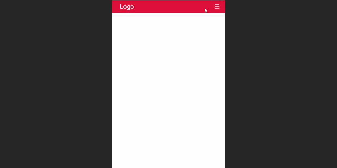
5. Adding The Toggle Button
We will now add a toggle button so we can toggle the navigation bar using JavaScript. We will use this ☰ hamburger icon as the toggle button. We will use the html entity for that icon. Which is ☰ We will use a span element for this. So let’s just add the following html code inside the nav element.
<span>☰</span>
You will see the following output in your browser.

As you can see that it’s not looking right as the hamburger icon is on the left corner. So let’s give it a class so we can style it and make it look better. Let’s give the span element a class named toggle-button. After adding the class the span element will look like the following.
<span class="toggle-button">☰</span>
6. Adding Styles to The Toggle Button
First we will position the hamburger icon to the top right corner. Then let’s make it white and give it a bigger font. Also let’s make the cursor a pointer when hovering over it to simulate it as a button. To achieve that let’s add the following CSS.
.toggle-button {
    position: absolute;
    top: 6px;
    right: 20px;
    color: rgba(255,255,255,0.8);
    font-size: 24px;
    cursor: pointer;
}
You will see the following output in your browser.

On mobile it will look like the following.
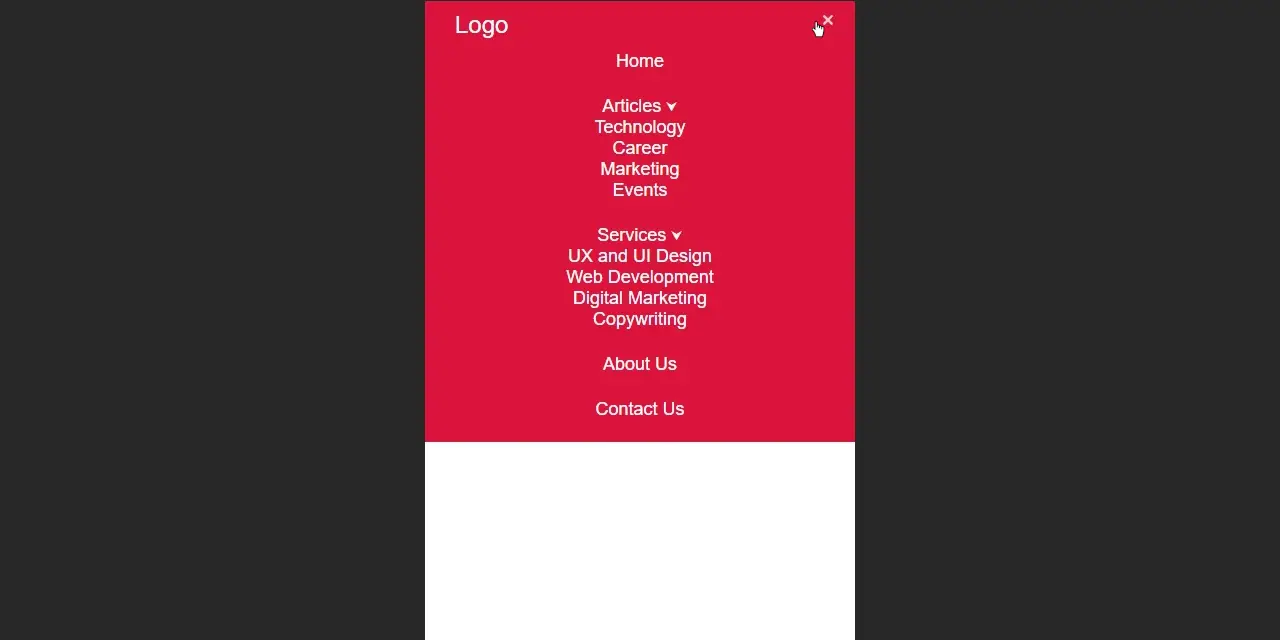
Now we need to make the toggle button functional so it shows the menu only when someone clicks on the hamburger menu. To do that we will hide the menu using CSS and to make it visible we use a class named active which will be given to the menu using JavaScript later. So let’s add the following CSS to achieve that.
.main-menu {
    display: none;
}
.active.main-menu {
    display: block;
}
After that it will look like the following on mobile.
Now let’s add some JavaScript to make the menu visible when someone clicks on the hamburger icon.
7. Adding JavaScript for The Toggle Button
We will toggle a class named active to the ul element which has the class named main-menu when someone clicks one the hamburger icon using JavaScript. We will use the click event listener for this. To add the JavaScript code we will first create a script.js file and link it to our index.html file using the script element. After creating the script.js file let’s add the following JavaScript code to our script.js file.
const toggleButton = document.querySelector(".toggle-button");
const mainMenu = document.querySelector(".main-menu");

toggleButton.addEventListener('click', function () {
    // Toggles the active class
    mainMenu.classList.toggle('active');
});
After that it will work like the following on mobile.
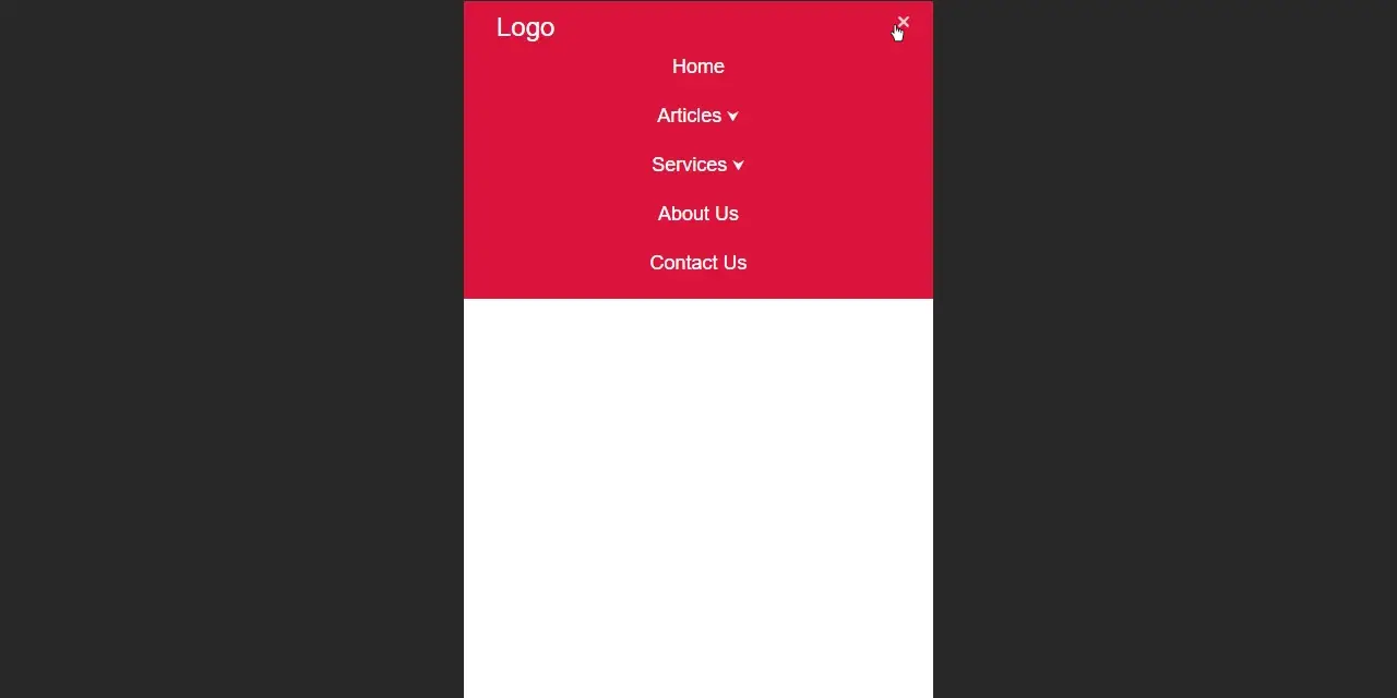
We can see that the toggle button works but it doesn’t have a closing icon (x). Which doesn’t look right. Let’s add the closing icon when the menu is open and change it back to hamburger icon when it is closed.
To do that we will use the contains method of classList to check if the menu has the active class and if it does then using the innerHTML method we will change the hamburger icon to closing icon (x). We will use the html entity for that closing icon which is ×.
The code will look like the following to achieve that.
const toggleButton = document.querySelector(".toggle-button");
const mainMenu = document.querySelector(".main-menu");

toggleButton.addEventListener('click', function () {
    // Toggles the active class
    mainMenu.classList.toggle('active');
        if (mainMenu.classList.contains("active")) {
            // Adds the close (x) icon
            toggleButton.innerHTML = "×";
        } else {
            // Adds the hamburger icon
            toggleButton.innerHTML = "☰";
        }
});
After adding this code it will work like the following on mobile.
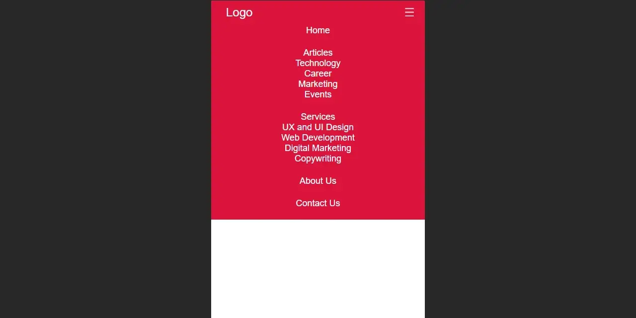
8. Adding Styles to the Submenu
Now let’s add some styles to the submenu to make it so clean and clear. We will use the ::after pseudo element to add a little down arrow icon next to each menu item that has a submenu to indicate that it has a submenu. We will be using the unicode for that arrow icon which is “\2B9F”. Let’s add the following CSS to achieve that.
.has-submenu > a::after {
    content: "\2B9F";
    font-size: 14px;
    padding-left: 4px;
    vertical-align: top;
}
After adding this code you will see the following on mobile.
Also let’s give some space to the submenu items using the following CSS.
.submenu-item a {
    display: inline-block;
    padding-top: 12px;
}
After adding this code you will see the following on mobile.

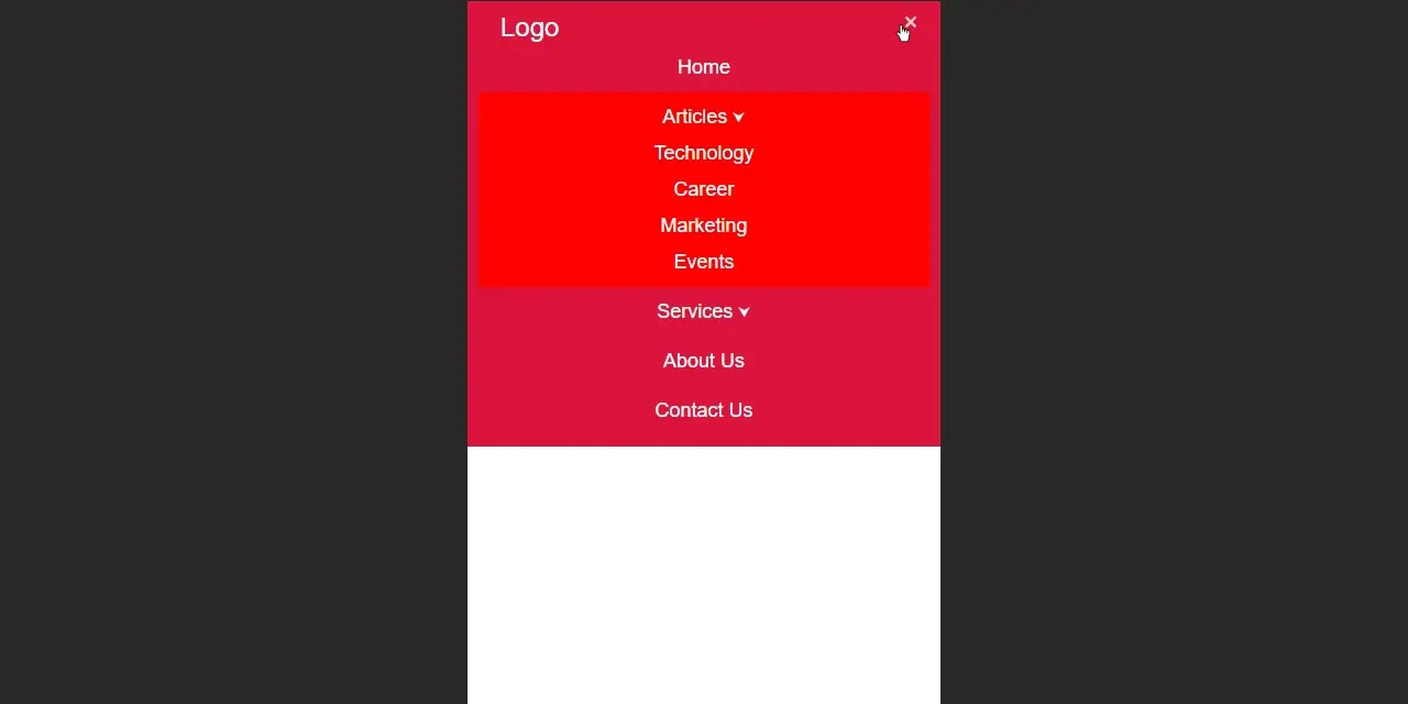
We will also make the background of the active submenu red using the following CSS.
.submenu-active {
    background-color: red;
}
After adding this code you will see the following on mobile.
The submenu needs to toggle when someone clicks on it. To do that we need to hide the submenu using CSS and to make it visible we will use a class named submenu-active. We will give that class to the submenu using JavaScript later. So let’s add the following CSS to achieve that.
.submenu {
    display: none;
}
.submenu-active .submenu {
    display: block;
}
After adding this code you will see the following on mobile.
9. Adding JavaScript for the Submenu
Now we will toggle a class named submenu-active to the li elements which contains the submenu when someone clicks on them. We will use the click event listener for this.
After toggling the submenu-active class we will also remove that class from any other li elements which may have that previously. Otherwise more than one submenu could be open at the same time.
We will apply that on every li element if they have a submenu using the for…of loop. We will use the click event listener as well as the keypress event listener for the keyboard users.
To achieve that let’s add the following JavaScript to our script.js file.
/* Adding Dropdowns to the Submenu */
const menuItems = document.querySelectorAll(".menu-item");
/* Activate Submenu */
function toggleItem() {
  if (this.classList.contains("submenu-active")) {
    this.classList.remove("submenu-active");
  } else if (mainMenu.querySelector(".submenu-active")) {
    mainMenu.querySelector(".submenu-active").classList.remove("submenu-active");
    this.classList.add("submenu-active");
  } else {
    this.classList.add("submenu-active");
  }
}
/* Event Listeners */
for (let menuItem of menuItems) {
    if (menuItem.querySelector(".submenu")) {
        menuItem.addEventListener("click", toggleItem, false);
        menuItem.addEventListener("keypress", toggleItem, false);
    }
}
After adding this code it will work like the following on mobile.

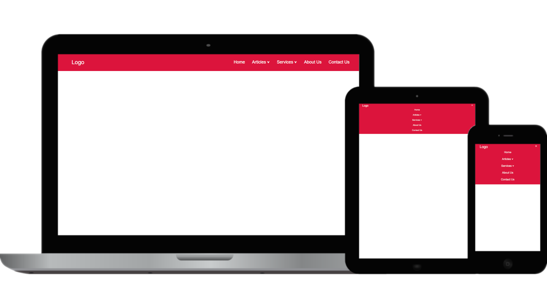
And with that our mobile version of the navigation bar is done. For the tablet version we will use the same style as the mobile version. Let’s work on the desktop version now.
10. Create the Desktop Navigation Bar
Our navigation bar will look like the following on the desktop now.

As you can see it’s not looking right since we want to show our menu with the dropdown there without the toggle button. So we will hide the toggle button first. Then make the menu visible. Let’s add the following CSS using the media query for desktop to achieve this.
@media screen and (min-width: 1025px) {
/* Hide Toggle */
.toggle-button {
display: none;
}
/* Make Menu Visible */
.main-menu {
display: block;
}
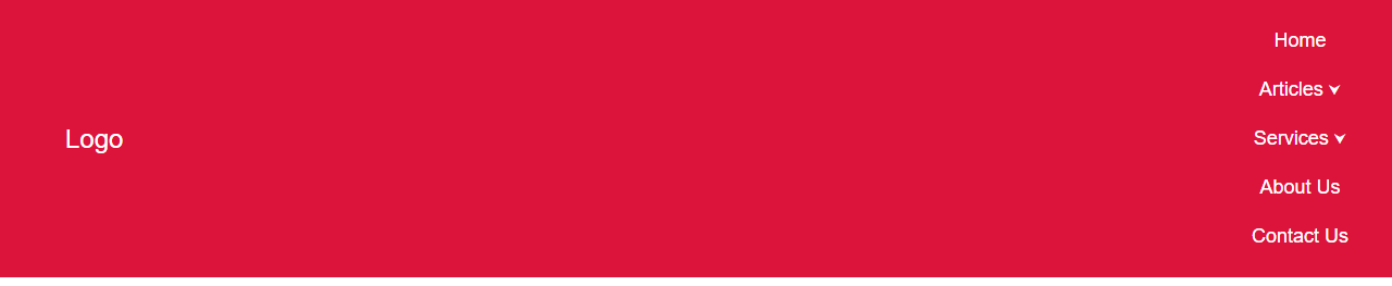
}The navigation bar will look like the following on the desktop now.

As you can see the menu doesn’t look right for the desktop. We need to make the menu items inline with the logo. To do that let’s set the display property of the navigation bar to flex and justify-content property to space-between. This will make the logo and the menu on the same line but on the opposite corner. Let’s add the following CSS inside the media query for desktop to achieve this.
   .navigation-bar {
        display: flex;
        justify-content: space-between;
        align-items: center;
        padding: 15px 40px;
    }
The navigation bar will look like the following on the desktop now.
We need to make the menu items horizontal and give some space between them. We will also change the background-color for the submenu so they blend in with the navigation bar. Let’s add the following CSS inside the media query for desktop to achieve this.
   .main-menu {
        display: flex;
    }
    .menu-item {
        margin-left: 30px;
        position: relative;
        display: block;
        width: auto;
    }
    .submenu-active {
        background-color: crimson;
    }
You can see that we have set the position property of the menu items to relative. We need to do that in order to make the submenus work properly. We will explain that in a bit.
The navigation bar will work like the following on the desktop now.
As you can see our dropdown isn’t working properly. We will fix that by setting the position property of the submenu to absolute. That is why we set the position property of the menu items to relative earlier. We will give the submenu items some spaces so they look better. Let’s add the following CSS inside the media query for desktop to achieve this.
   .submenu-active .submenu {
        position: absolute;
        left: 0;
        top: 50px;
        background-color: crimson;
        padding: 0 20px 20px 20px;
        width: 200px;
        text-align: left;
    }
The navigation bar will work like the following on the desktop now.
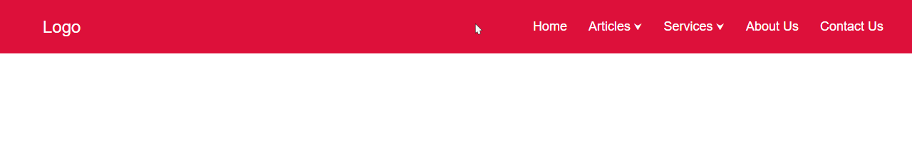
Now let’s add a hover color to the logo and the menu items. Let’s add the following CSS to achieve that.
   /* Hover Style */
    .logo:hover,
    .menu-item a:hover {
        color: yellow;
    }
The navigation bar will work like the following on the desktop now.
11. Close Submenu From Anywhere
You have probably noticed that the dropdown doesn’t close when the user hovers away from the menu. This could be annoying as it can hide the contents of the page. So let’s give the users the ability so they can close the submenu by clicking anywhere on the page.
To do that first we will check to see if any submenu is open or not. If any of them are open then we will also check to see if the user clicked inside of it or not using the target property. If the user clicked anywhere else on the page except the submenu then we will close the submenu by removing the class named submenu-active. We will use the click event listener to the document object since we want it to work for the whole page.
To achieve that let’s add the following JavaScript to our script.js file.
/* Close Submenu From Anywhere */
function closeSubmenu(e) {
    if (mainMenu.querySelector(".submenu-active")) {
      let isClickInside = mainMenu.querySelector(".submenu-active").contains(e.target);
      if (!isClickInside && mainMenu.querySelector(".submenu-active")) {
        mainMenu.querySelector(".submenu-active").classList.remove("submenu-active");
      }
    }
  }
/* Event listener */
  document.addEventListener("click", closeSubmenu, false);
After adding the above JavaScript it will work like the following on desktop.
And with that our desktop version is also done.
Conclusion
I hope this blog helps you to build a responsive navigation bar with a dropdown menu with a focus on mobile-first design. This blog ensures a seamless experience on various devices. All we needed was some HTML, some CSS, and a little bit of JavaScript to make the navigation bar accessible and functional.
")


