
If you are passionate about web development and want to enhance your skills then you have come to the right place. In this video I have made a burger website with Tailwind CSS so that you can learn better.
Why Tailwind CSS?
Tailwind CSS is a utility-first framework that offers many predefined classes to help you as they say rapidly build modern websites without ever leaving your HTML other popular CSS libraries and Frameworks like bootstrap material UI and others. They’re more opinionated and that is to say when I see a website styled with bootstrap or material UI I visually recognize it.
Tailwind CSS applies one CSS rule at a time it just uses predefined classes and that makes it very flexible and you can still style an element any way you want. Now the strength of Tailwind is that once you learn the classes you can apply it very quickly definitely faster than writing CSS from scratch.
Who Is This Course For?
If you know css well and have no idea about tailwind css, or have some idea but want to learn more then this course will be very good for you. Along with tailwind CSS you will get some basic idea about javascript.
Video Tutorial :
What Will You Learn
1. Tailwind CSS Setup: Tailwind css has few methods of setup, Here I used Tailwind CLI. This is very easy and fastest way to set up and starting with Tailwind CSS from scratch.
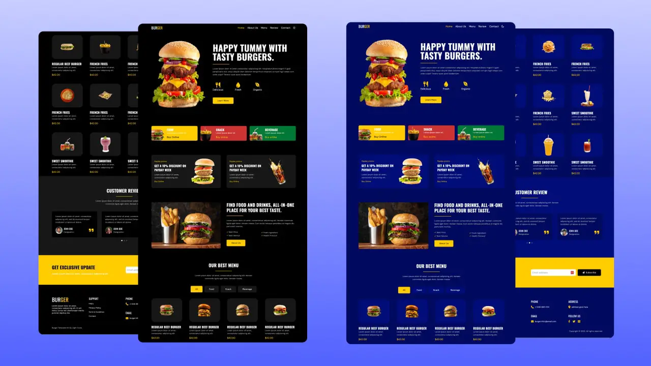
2. A Lot of Sections: It is really important to include your content in different sections to show a clear and engaging user experience So I created few sections like navigation, hero section, category section, promo section, about section, menu section, review section, contact section and footer section.
3. Active Link: Creating an “active link” feature is very essential for users. It makes easier to understand a user which section the user is currently staying in. When a user clicks on a navigation link, the link becomes active and change to a different style. To achieve this, We use javascript.
4. Responsive Design: Responsive website design is a web design way to create web pages render well. It is the practice of creating a website fitting to work on every screen size and every device and no matter how large or small, mobile or desktop. In Tailwind CSS, it’s very easy to build a responsive design so we were able to build a fully responsive burger website perfectly.
5. Dark/Light Mode: In this video we have added dark mode and light mode themes so users can choose what they like.
6. Responsive Navbar: We’re going to explain the easiest approach to create a responsive navbar using TailwindCSS. TailwindCSS that makes it easy to build responsive and consistent layouts & with javascript we can add dynamic functionality to our navbar.
6. Scroll Up Button: We created a button called scroll up button. If you scroll down a bit that button will appear and if you click on that button it will take you to the top.
7. Scroll Reveal Animation: Creating scroll animation feature is very essential for users. Scroll animations are the animation taking place while the user scrolls up or down a website. Essentially the scrolling animation is activated when the element comes into view.
8. Tab-based filtering: In this video, we created Tab-based filtering which is an effective way to allow users to sort and filter items on your website. When users click on different tabs, the displayed items change accordingly.
Overall, We think this video will be a good opportunity for web developers to improve their skills in web development with Tailwind CSS and some basic JavaScript. By the end of this tutorial, viewers will be able to build a fully responsive burger website with Tailwind CSS with various dynamic features.
After downloading, Please follow the steps below:
- open up terminal
- npm install
- npm run watch
- Open with Live Server


")

