
Overview
Almost always the first thing we have to do when building a website is creating a navigation bar. Since the majority of today’s websites are responsive we also have to make sure our navigation bar is responsive.
In this blog we will learn exactly how to build a responsive navigation bar which will work across devices like mobile, tablet and desktop. We will also make it accessible for screen readers. All you need to know is basic HTML, CSS and JavaScript.
We will be taking the mobile first approach to build our navigation bar which is a fancy way of saying that, we will be styling the navigation bar for mobile devices first then using media queries we will style for the tablet and desktop.
Let’s dive in.
1. Adding the Starter HTML
First we need to create an HTML file. Let’s name it index.html. Our navigation bar will contain a logo, a menu and a toggle button. The HTML will contain an a element for logo, ul element for the menu, a inside the li element for the menu items inside a nav element.
The html will look like the following.
   <nav>
        <a href="#">Logo</a>
        <ul>
            <li><a href="#">Home</a></li>
            <li><a href="#">Articles</a></li>
            <li><a href="#">Services</a></li>
            <li><a href="#">About Us</a></li>
            <li><a href="#">Contact Us</a></li>
        </ul>
    </nav>
The # in href=”#” refers to the link you want there.
You will see the following output in your browser.

If your output is like this you are good to follow the rest.
2. Adding the Classes to HTML
Now Let’s add some classes to these elements so it’s easier to style them using CSS.
We will give the nav element a class named navigation-bar, the a element will have a class named logo, the ul will have a class named main-menu and the a element inside the li will have a class named menu-item.
After adding the classes the html will look like the following.
   <nav class="navigation-bar">
        <a href="#" class="logo">Logo</a>
        <ul class="main-menu">
            <li><a href="#" class="menu-item">Home</a></li>
            <li><a href="#" class="menu-item">Articles</a></li>
            <li><a href="#" class="menu-item">Services</a></li>
            <li><a href="#" class="menu-item">About Us</a></li>
            <li><a href="#" class="menu-item">Contact Us</a></li>
        </ul>
    </nav>
3. Adding Basic CSS
Now we will add some CSS to remove some default styles of the elements and to add some baseline styles of the elements. We will use universal selector (*) to remove the default padding and margins of the elements and set the box-sizing property to border-box so we can easily resize the elements.
We will also set a default font of our liking and give the navigation bar a background-color. So let’s create a style.css file and link that to our index.html file using the link element. Now we will add the following CSS code to our style.css file.
* {
    box-sizing: border-box;
    padding: 0;
    margin: 0;
}
body {
    font-family: 'Montserrat', sans-serif;
}
.navigation-bar {
    font-size: 18px;
    background-color: crimson;
    padding: 10px 10px;
}
.main-menu {
    list-style-type: none;
}
.menu-item,
.logo {
    text-decoration: none;
    color: white;
}
After adding the basic CSS you will see the following output in your browser.

4. Adding Styles to Menu Items and Logo
Now let’s give some breathing space to the elements so they look clean. The CSS styles for that will be the following.
.main-menu li {
    text-align: center;
    margin: 16px auto;
}
.logo {
    display: inline-block;
    font-size: 24px;
    margin-top: 10px;
    margin-left: 20px;
}
You will see the following output in your browser after adding the above CSS.
5. Adding Toggle Button
It’s looking good so far. Now let’s add a toggle button. We will use this ☰ hamburger icon as the toggle button. We will use an html entity for that icon. Which is ☰ We will use a span element for this. So let’s add the following html code inside the nav element to achieve this.
<span>☰</span>
You will see the following output in your browser.

You can see that the hamburger icon is on the left corner. So let’s give it a class and style it so it looks OK. We will give the span element a class named toggle-button. After adding the class the span element will look like the following.
<span class="toggle-button">☰</span>
6. Adding Styles to Toggle Button
Now let’s position the hamburger icon to the top right corner. Make it white and give it a bigger font. Also make the cursor a pointer when hovering over it. To achieve that let’s add the following CSS.
.toggle-button {
    position: absolute;
    top: 10px;
    right: 20px;
    color: rgba(255,255,255,0.8);
    font-size: 24px;
    cursor: pointer;
}
You will see the following output in your browser.

On mobile it will look like the following.

We are almost there for mobile devices. All we need to do is make the toggle button work so the menu shows only when the visitors click on the hamburger menu. To do that the menu needs to be hidden by default.
We can achieve that by setting the display property to none to the existing main-menu class selector in our CSS file. After adding that property it will look like the following.
.main-menu {
    list-style-type: none;
    display: none;
}
After that it will look like the following on mobile.

Now we will add some JavaScript to make the menu visible when someone clicks on the hamburger icon.
7. Adding JavaScript
Using JavaScript we will toggle a class named active to the ul element when someone clicks on the hamburger icon. We will use the click event listener to toggle the active class to the ul element which when someone clicks on the logo.
So let’s create a script.js file and link it to our index.html using the script element. Now we will add the following code to our script.js file.
const toggleButton = document.querySelector(".toggle-button");
const mainMenu = document.querySelector(".main-menu");

toggleButton.addEventListener('click', function () {
    // Toggles the active class
    mainMenu.classList.toggle('active');
});
Also we need to make the active class visible. To do that let’s add the following CSS code.
.active {
    display: block;
  }
After that it will work like the following on mobile.

As you can see the toggle button works as expected but we don’t have a closing icon (x). Which could be confusing for a lot of users. We will use an html entity for the closing icon which is × When we are toggling the menu we will also change the icons.
We will use the contains method of classList to check if the menu has the active class. If it does then we will use the innerHTML method to change the hamburger icon to closing icon (x). And if it doesn’t then we will use the same technique to change the closing icon (x) to hamburger icon.
After adding the codes to achieve this the JavaScript code will look like the following.
const toggleButton = document.querySelector(".toggle-button");
const mainMenu = document.querySelector(".main-menu");

toggleButton.addEventListener('click', function () {
    // Toggles the active class
    mainMenu.classList.toggle('active');
        if (mainMenu.classList.contains("active")) {
            // Adds the close (x) icon
            toggleButton.innerHTML = "×";
        } else {
            // Adds the hamburger icon
            toggleButton.innerHTML = "☰";
        }
});
After adding this code it will work like the following on mobile.
And with that our mobile version of the navigation bar is done. For the tablet version we will use the same style as the mobile version. Let’s work on the desktop version now.
8. Create the Desktop Navigation Bar
On the desktop the toggle button will be hidden. The navigation bar will have a display property of flex and justify-content property of space-between so the logo and the menu stays inline and on the opposite corner.
The menu will also have the display property of flex. So the menu is visible and the menu items are inline. We will also add some necessary margin and padding to make the navigation bar look nice. We will do all those inside a media query for the desktop. The CSS code for the desktop will look like the following.
/* For Desktop Start */
@media screen and (min-width: 768px) {
.toggle-button {
display: none;
}
.navigation-bar {
display: flex;
justify-content: space-between;
align-items: center;
padding: 25px 40px;
}
.main-menu {
display: flex;
}
.logo, .main-menu li {
margin: 0;
}
.menu-item {
margin-left: 30px;
}
.logo:hover,
.menu-item:hover {
color: yellow;
}
}
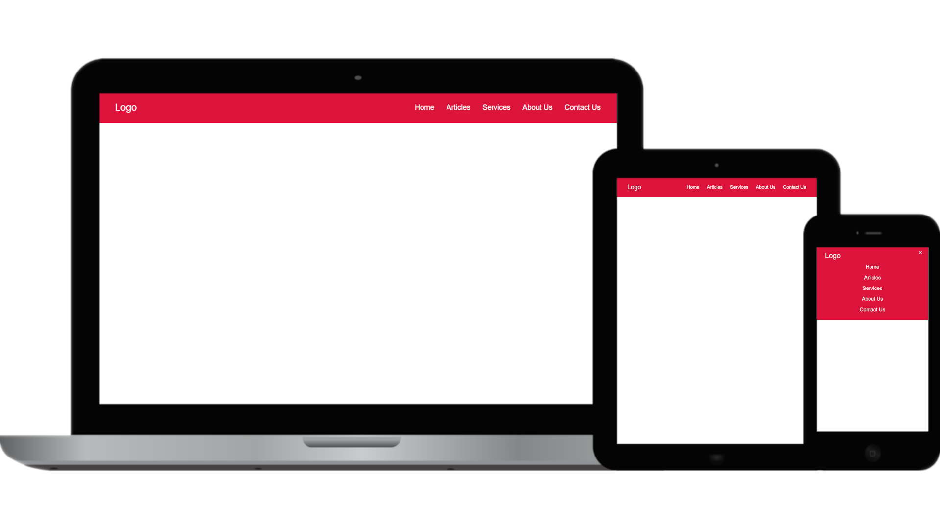
/* For Desktop Ends */After adding the above css it will look like the following on desktop.

And with that our desktop version is also done.
Conclusion
I hope this blog provides a practical guide for building a responsive navigation bar that works on mobile, tablet, and desktop screens. All we needed was some HTML, some CSS, and a little bit of JavaScript to make the navigation bar both functional and visually appealing.


")

