
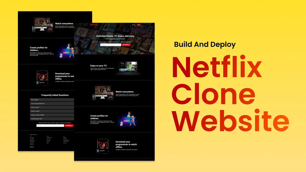
Hey there, Welcome to this tutorial where I’ll show you how to create a Netflix clone website using HTML and CSS.
In this video, you’ll learn how to build a website that looks and feels like the real Netflix platform, with all the features you love, such as the navigation bar, the featured section, and rows of movies and TV shows, accordion section and footer section.
But the question is why the Netflix website?
Its a very simple design but If you are new to coding, there are many things you can learn that you may not have known before.
- You can learn how to make an image full width
- How to embed a video within an image
- And how to create an accordion section using only HTML and CSS. I am not going to use javascript
Whether you’re a beginner or an experienced developer, this tutorial will guide you through the process step-by-step. You don’t need to be an expert in coding to follow along. I will explain everything in a way that’s easy to understand, so you can follow along even if you’re new to web development.
By the end of this video, you’ll have a fully responsive Netflix clone website that You can use this website as a portfolio project or as a starting point to create your own unique streaming service.
And finally we will learn how to upload this website to the online server or netlify website so that anyone can see our website through the internet.
Video Tutorial :
Source Codes
First, create an HTML file with the name index.html and paste the given codes into your HTML file. Remember, you’ve to create a file with a .html extension.
<!DOCTYPE html>
<html lang="en">
<head>
    <meta charset="UTF-8">
    <meta http-equiv="X-UA-Compatible" content="IE=edge">
    <meta name="viewport" content="width=device-width, initial-scale=1.0">
    <link rel="shortcut icon" href="https://assets.nflxext.com/us/ffe/siteui/common/icons/nficon2016.ico" type="image/x-icon">
    <link rel="stylesheet" href="./style.css">
    <title>Netflix Clone</title>
</head>
<body>
    <!-- header  -->
    <div class="header">
        <div class="container">
            <nav class="navbar">
                <a href="#" class="logo">
                    <svg viewBox="0 0 111 30" version="1.1" xmlns="http://www.w3.org/2000/svg" xmlns:xlink="http://www.w3.org/1999/xlink" aria-hidden="true" role="img" class="default-ltr-cache-ag96qb"><g><path d="M105.06233,14.2806261 L110.999156,30 C109.249227,29.7497422 107.500234,29.4366857 105.718437,29.1554972 L102.374168,20.4686475 L98.9371075,28.4375293 C97.2499766,28.1563408 95.5928391,28.061674 93.9057081,27.8432843 L99.9372012,14.0931671 L94.4680851,-5.68434189e-14 L99.5313525,-5.68434189e-14 L102.593495,7.87421502 L105.874965,-5.68434189e-14 L110.999156,-5.68434189e-14 L105.06233,14.2806261 Z M90.4686475,-5.68434189e-14 L85.8749649,-5.68434189e-14 L85.8749649,27.2499766 C87.3746368,27.3437061 88.9371075,27.4055675 90.4686475,27.5930265 L90.4686475,-5.68434189e-14 Z M81.9055207,26.93692 C77.7186241,26.6557316 73.5307901,26.4064111 69.250164,26.3117443 L69.250164,-5.68434189e-14 L73.9366389,-5.68434189e-14 L73.9366389,21.8745899 C76.6248008,21.9373887 79.3120255,22.1557784 81.9055207,22.2804387 L81.9055207,26.93692 Z M64.2496954,10.6561065 L64.2496954,15.3435186 L57.8442216,15.3435186 L57.8442216,25.9996251 L53.2186709,25.9996251 L53.2186709,-5.68434189e-14 L66.3436123,-5.68434189e-14 L66.3436123,4.68741213 L57.8442216,4.68741213 L57.8442216,10.6561065 L64.2496954,10.6561065 Z M45.3435186,4.68741213 L45.3435186,26.2498828 C43.7810479,26.2498828 42.1876465,26.2498828 40.6561065,26.3117443 L40.6561065,4.68741213 L35.8121661,4.68741213 L35.8121661,-5.68434189e-14 L50.2183897,-5.68434189e-14 L50.2183897,4.68741213 L45.3435186,4.68741213 Z M30.749836,15.5928391 C28.687787,15.5928391 26.2498828,15.5928391 24.4999531,15.6875059 L24.4999531,22.6562939 C27.2499766,22.4678976 30,22.2495079 32.7809542,22.1557784 L32.7809542,26.6557316 L19.812541,27.6876933 L19.812541,-5.68434189e-14 L32.7809542,-5.68434189e-14 L32.7809542,4.68741213 L24.4999531,4.68741213 L24.4999531,10.9991564 C26.3126816,10.9991564 29.0936358,10.9054269 30.749836,10.9054269 L30.749836,15.5928391 Z M4.78114163,12.9684132 L4.78114163,29.3429562 C3.09401069,29.5313525 1.59340144,29.7497422 0,30 L0,-5.68434189e-14 L4.4690224,-5.68434189e-14 L10.562377,17.0315868 L10.562377,-5.68434189e-14 L15.2497891,-5.68434189e-14 L15.2497891,28.061674 C13.5935889,28.3437998 11.906458,28.4375293 10.1246602,28.6868498 L4.78114163,12.9684132 Z"></path></g></svg>
                </a>

                <div class="select-box">
                    <svg width="16" height="16" viewBox="0 0 16 16" fill="none" ><path fill-rule="evenodd" clip-rule="evenodd" d="M8,14.5c0.23033,0 0.84266,-0.2257 1.48679,-1.514c0.27614,-0.5523 0.51294,-1.2239 0.68801,-1.986h-4.3496c0.17507,0.7621 0.41187,1.4337 0.68801,1.986c0.64413,1.2883 1.25646,1.514 1.48679,1.514zM10.4224,9.5c0.0504,-0.47923 0.0776,-0.98089 0.0776,-1.5c0,-0.51911 -0.0272,-1.02077 -0.0776,-1.5h-4.84478c-0.05046,0.47923 -0.07762,0.98089 -0.07762,1.5c0,0.51911 0.02716,1.02077 0.07762,1.5zM11.7092,11c-0.227,1.1217 -0.5775,2.117 -1.0178,2.9184c1.3223,-0.6023 2.4073,-1.6347 3.0764,-2.9184zM14.5,8c0,-0.51627 -0.0602,-1.01848 -0.1739,-1.5h-2.3963c0.0461,0.48588 0.0702,0.98731 0.0702,1.5c0,0.51269 -0.0241,1.01412 -0.0702,1.5h2.3963c0.1137,-0.48152 0.1739,-0.98373 0.1739,-1.5zM4,8c0,-0.51269 0.02411,-1.01412 0.0702,-1.5h-2.39627c-0.11374,0.48152 -0.17393,0.98373 -0.17393,1.5c0,0.51627 0.06019,1.01848 0.17393,1.5h2.39627c-0.04609,-0.48588 -0.0702,-0.98731 -0.0702,-1.5zM5.30864,13.9184c-0.44032,-0.8014 -0.79085,-1.7967 -1.01788,-2.9184h-2.05855c0.66907,1.2837 1.75414,2.3161 3.07643,2.9184zM5.8252,5h4.3496c-0.17507,-0.76207 -0.41187,-1.43374 -0.68801,-1.98603c-0.64413,-1.28826 -1.25646,-1.51397 -1.48679,-1.51397c-0.23033,0 -0.84266,0.22571 -1.48679,1.51397c-0.27614,0.55229 -0.51294,1.22396 -0.68801,1.98603zM11.7092,5h2.0586c-0.6691,-1.28373 -1.7541,-2.31611 -3.0764,-2.91838c0.4403,0.8014 0.7908,1.79668 1.0178,2.91838zM2.23221,5h2.05855c0.22703,-1.1217 0.57756,-2.11698 1.01788,-2.91838c-1.32229,0.60227 -2.40736,1.63466 -3.07643,2.91838zM8,0c4.4183,0 8,3.58172 8,8c0,4.4183 -3.5817,8 -8,8c-4.41828,0 -8,-3.5817 -8,-8c0,-4.41828 3.58172,-8 8,-8z" fill="currentColor"></path></svg>

                    <select>
                        <option value="">English</option>
                        <option value="">Swedish</option>
                    </select>
                </div>

                <a href="#" class="signin-btn">Sign In</a>
            </nav>

            <!-- header content  -->
            <div class="header-content">
                <h1>Unlimited movies, TV shows, and more.</h1>
                <h2>Watch anywhere. Cancel anytime.</h2>

                <div class="form-field">
                    <h3>Ready to watch? Enter your email to create or restart your membership.</h3>

                    <form class="form">
                        <div class="form-group">
                            <input type="email" class="form-input" placeholder=" " id="email">
                            <label for="email" class="form-label">Email Address</label>
                        </div>

                        <button class="get-btn">
                            <span>Get Started</span>
                            <svg width="24" height="24" viewBox="0 0 24 24" fill="none" xmlns="http://www.w3.org/2000/svg" class="Hawkins-Icon Hawkins-Icon-Standard"><path fill-rule="evenodd" clip-rule="evenodd" d="M7.29297 19.2928L14.5859 12L7.29297 4.70706L8.70718 3.29285L16.7072 11.2928C16.8947 11.4804 17.0001 11.7347 17.0001 12C17.0001 12.2652 16.8947 12.5195 16.7072 12.7071L8.70718 20.7071L7.29297 19.2928Z" fill="currentColor"></path></svg>
                        </button>
                    </form>
                </div>
            </div>
        </div>
    </div>

    <main>
        <section>
            <div class="container">
                <div class="section-wrap">
                    <div class="section-content">
                        <h1>Enjoy on your TV.</h1>
                        <p>Eatch on smart TVs, PlayStation, Xbox, chromecast, Apple TV, Bluray players and more</p>
                    </div>

                    <div class="section-media">
                        <img src="https://assets.nflxext.com/ffe/siteui/acquisition/ourStory/fuji/desktop/tv.png" alt="">

                        <div class="video-div video-1">
                            <video autoplay="" playsinline="" muted="" loop="">
                                <source src="https://assets.nflxext.com/ffe/siteui/acquisition/ourStory/fuji/desktop/video-tv-0819.m4v" type="video/mp4">
                            </video>
                        </div>
                    </div>
                </div>
            </div>
        </section>

        <section>
            <div class="container">
                <div class="section-wrap reverse">
                    <div class="section-content">
                        <h1>Watch everywhere.</h1>
                        <p>Stream unlimited films and TV programmes on your phone, tablet, laptop and TV without paying more.</p>
                    </div>

                    <div class="section-media">
                        <img src="https://assets.nflxext.com/ffe/siteui/acquisition/ourStory/fuji/desktop/device-pile.png" alt="">

                        <div class="video-div video-2">
                            <video autoplay="" playsinline="" muted="" loop="">
                                <source src="https://assets.nflxext.com/ffe/siteui/acquisition/ourStory/fuji/desktop/video-devices.m4v" type="video/mp4">
                            </video>
                        </div>
                    </div>
                </div>
            </div>
        </section>

        <section>
            <div class="container">
                <div class="section-wrap">
                    <div class="section-content">
                        <h1>Create profiles for children..</h1>
                        <p>Send children on adventures with their favourite characters in a space made just for them – free with your membership.</p>
                    </div>

                    <div class="section-media">
                        <img src="https://occ-0-299-2773.1.nflxso.net/dnm/api/v6/19OhWN2dO19C9txTON9tvTFtefw/AAAABYjXrxZKtrzxQRVQNn2aIByoomnlbXmJ-uBy7du8a5Si3xqIsgerTlwJZG1vMpqer2kvcILy0UJQnjfRUQ5cEr7gQlYqXfxUg7bz.png?r=420" alt="">
                    </div>
                </div>
            </div>
        </section>

        <section>
            <div class="container">
                <div class="section-wrap reverse">
                    <div class="section-content">
                        <h1>Download your programmes to watch offline.</h1>
                        <p>Available on all plans except Basic with adverts.</p>
                    </div>

                    <div class="section-media">
                        <img src="https://assets.nflxext.com/ffe/siteui/acquisition/ourStory/fuji/desktop/mobile-0819.jpg" alt="">

                        <div class="overlay-box">
                            <div class="overlay-box-img">
                                <img src="https://assets.nflxext.com/ffe/siteui/acquisition/ourStory/fuji/desktop/boxshot.png" alt="">
                            </div>

                            <div class="overlay-box-text">
                                <h4>Stranger Things</h4>
                                <p>Downloading...</p>
                            </div>

                            <div class="download-animation"></div>
                        </div>
                    </div>
                </div>
            </div>
        </section>

        <section>
            <div class="container section-faq">
                <h1>Frequently Asked Questions</h1>

                <div class="accordion">
                    <div class="question">
                        <input type="checkbox" id="q1">
                        <label for="q1" class="title">
                            What is Netflix?
                            <svg xmlns="http://www.w3.org/2000/svg" fill="none" viewBox="0 0 24 24" stroke-width="1.5" stroke="currentColor" class="w-6 h-6"><path stroke-linecap="round" stroke-linejoin="round" d="M6 18L18 6M6 6l12 12" /></svg>
                        </label>

                        <div class="answer">
                            <p>Netflix is a streaming service that offers a wide variety of award-winning TV shows, movies, anime, documentaries, and more on thousands of internet-connected devices.</p>
                            <p>You can watch as much as you want, whenever you want without a single commercial – all for one low monthly price. There's always something new to discover and new TV shows and movies are added every week!</p>
                        </div>
                    </div>

                    <div class="question">
                        <input type="checkbox" id="q2">
                        <label for="q2" class="title">
                            How much does Netflix cost?
                            <svg xmlns="http://www.w3.org/2000/svg" fill="none" viewBox="0 0 24 24" stroke-width="1.5" stroke="currentColor" class="w-6 h-6"><path stroke-linecap="round" stroke-linejoin="round" d="M6 18L18 6M6 6l12 12" /></svg>
                        </label>

                        <div class="answer">
                            <p> Watch Netflix on your smartphone, tablet, Smart TV, laptop, or streaming device, all for one fixed monthly fee. Plans range from USD3.99 to USD11.99 a month. No extra costs, no contracts.</p>
                        </div>
                    </div>


                    <div class="question">
                        <input type="checkbox" id="q3">
                        <label class="title" for="q3">
                            How do I cancel?

                            <svg xmlns="http://www.w3.org/2000/svg" fill="none" viewBox="0 0 24 24" stroke-width="1.5" stroke="currentColor" class="w-6 h-6">
                                <path stroke-linecap="round" stroke-linejoin="round" d="M6 18L18 6M6 6l12 12" />
                            </svg>

                        </label>
                        <div class="answer">
                        <p>Watch anywhere, anytime. Sign in with your Netflix account to watch instantly on the web at netflix.com from your personal computer or on any internet-connected device that offers the Netflix app, including smart TVs, smartphones, tablets, streaming media players and game consoles.</p>

                        <p>You can also download your favorite shows with the iOS, Android, or Windows 10 app. Use downloads to watch while you're on the go and without an internet connection. Take Netflix with you anywhere.</p>
                        </div>
                    </div>

                    <div class="question">
                        <input type="checkbox" id="q4">
                        <label class="title" for="q4">
                            Wher can I watch?

                            <svg xmlns="http://www.w3.org/2000/svg" fill="none" viewBox="0 0 24 24" stroke-width="1.5" stroke="currentColor" class="w-6 h-6">
                                <path stroke-linecap="round" stroke-linejoin="round" d="M6 18L18 6M6 6l12 12" />
                            </svg>

                        </label>
                        <div class="answer">
                            <p>Watch anywhere, anytime. Sign in with your Netflix account to watch instantly on the web at netflix.com from your personal computer or on any internet-connected device that offers the Netflix app, including smart TVs, smartphones, tablets, streaming media players and game consoles.</p>

                            <p>You can also download your favorite shows with the iOS, Android, or Windows 10 app. Use downloads to watch while you're on the go and without an internet connection. Take Netflix with you anywhere.</p>
                        </div>
                    </div>

                    <div class="question">
                        <input type="checkbox" id="q5">
                        <label class="title" for="q5">
                            What can I watch on Netflix?

                            <svg xmlns="http://www.w3.org/2000/svg" fill="none" viewBox="0 0 24 24" stroke-width="1.5" stroke="currentColor" class="w-6 h-6">
                                <path stroke-linecap="round" stroke-linejoin="round" d="M6 18L18 6M6 6l12 12" />
                            </svg>

                        </label>
                        <div class="answer">
                            <p>Netflix has an extensive library of feature films, documentaries, TV shows, anime, award-winning Netflix originals, and more. Watch as much as you want, anytime you want.</p>
                        </div>
                    </div>

                    <div class="question">
                        <input type="checkbox" id="q6">
                        <label class="title" for="q6">
                            Is Netflix good for kids?

                            <svg xmlns="http://www.w3.org/2000/svg" fill="none" viewBox="0 0 24 24" stroke-width="1.5" stroke="currentColor" class="w-6 h-6">
                                <path stroke-linecap="round" stroke-linejoin="round" d="M6 18L18 6M6 6l12 12" />
                            </svg>

                        </label>
                        <div class="answer">
                            <p>The Netflix Kids experience is included in your membership to give parents control while kids enjoy family-friendly TV shows and movies in their own space.</p>

                            <p>Kids profiles come with PIN-protected parental controls that let you restrict the maturity rating of content kids can watch and block specific titles you don’t want kids to see.</p>
                        </div>
                    </div>
                </div>
                <div class="form-field">
                    <h3>Ready to watch? Enter your email to create or restart your membership.</h3>

                    <form class="form">
                        <div class="form-group">
                            <input type="email" class="form-input" placeholder=" " id="email">
                            <label for="email" class="form-label">Email Address</label>
                        </div>

                        <button class="get-btn">
                            <span>Get Started</span>
                            <svg width="24" height="24" viewBox="0 0 24 24" fill="none" xmlns="http://www.w3.org/2000/svg" class="Hawkins-Icon Hawkins-Icon-Standard"><path fill-rule="evenodd" clip-rule="evenodd" d="M7.29297 19.2928L14.5859 12L7.29297 4.70706L8.70718 3.29285L16.7072 11.2928C16.8947 11.4804 17.0001 11.7347 17.0001 12C17.0001 12.2652 16.8947 12.5195 16.7072 12.7071L8.70718 20.7071L7.29297 19.2928Z" fill="currentColor"></path></svg>
                        </button>
                    </form>
                </div>
            </div>

        </section>
    </main>

    <footer class="footer">
        <div class="container">
            <a href="#">Questions? Contact us.</a>

            <ul class="grid-container">
                <li><a href="#">FAQ</a></li>
                <li><a href="#">Account</a></li>
                <li><a href="#">Jobs</a></li>
                <li><a href="#">Ways to Watch</a></li>
                <li><a href="#">Cookie Preferences</a></li>
                <li><a href="#">Speed Test</a></li>
                <li><a href="#">Only on Netflix</a></li>
                <li><a href="#">Gift card terms</a></li>
                <li><a href="#">Media Center</a></li>
                <li><a href="#">Redeem gift cards</a></li>
                <li><a href="#">Terms of Use</a></li>
                <li><a href="#">Corporate Information</a></li>
                <li><a href="#">Legal Guarantee</a></li>
                <li><a href="#">Help Center</a></li>
                <li><a href="#">Investor Relations</a></li>
                <li><a href="#">Buy gift cards</a></li>
                <li><a href="#">Privacy</a></li>
                <li><a href="#">Contact Us</a></li>
                <li><a href="#">Legal Notices</a></li>
            </ul>

            <div class="select-box">
                <svg width="16" height="16" viewBox="0 0 16 16" fill="none" ><path fill-rule="evenodd" clip-rule="evenodd" d="M8,14.5c0.23033,0 0.84266,-0.2257 1.48679,-1.514c0.27614,-0.5523 0.51294,-1.2239 0.68801,-1.986h-4.3496c0.17507,0.7621 0.41187,1.4337 0.68801,1.986c0.64413,1.2883 1.25646,1.514 1.48679,1.514zM10.4224,9.5c0.0504,-0.47923 0.0776,-0.98089 0.0776,-1.5c0,-0.51911 -0.0272,-1.02077 -0.0776,-1.5h-4.84478c-0.05046,0.47923 -0.07762,0.98089 -0.07762,1.5c0,0.51911 0.02716,1.02077 0.07762,1.5zM11.7092,11c-0.227,1.1217 -0.5775,2.117 -1.0178,2.9184c1.3223,-0.6023 2.4073,-1.6347 3.0764,-2.9184zM14.5,8c0,-0.51627 -0.0602,-1.01848 -0.1739,-1.5h-2.3963c0.0461,0.48588 0.0702,0.98731 0.0702,1.5c0,0.51269 -0.0241,1.01412 -0.0702,1.5h2.3963c0.1137,-0.48152 0.1739,-0.98373 0.1739,-1.5zM4,8c0,-0.51269 0.02411,-1.01412 0.0702,-1.5h-2.39627c-0.11374,0.48152 -0.17393,0.98373 -0.17393,1.5c0,0.51627 0.06019,1.01848 0.17393,1.5h2.39627c-0.04609,-0.48588 -0.0702,-0.98731 -0.0702,-1.5zM5.30864,13.9184c-0.44032,-0.8014 -0.79085,-1.7967 -1.01788,-2.9184h-2.05855c0.66907,1.2837 1.75414,2.3161 3.07643,2.9184zM5.8252,5h4.3496c-0.17507,-0.76207 -0.41187,-1.43374 -0.68801,-1.98603c-0.64413,-1.28826 -1.25646,-1.51397 -1.48679,-1.51397c-0.23033,0 -0.84266,0.22571 -1.48679,1.51397c-0.27614,0.55229 -0.51294,1.22396 -0.68801,1.98603zM11.7092,5h2.0586c-0.6691,-1.28373 -1.7541,-2.31611 -3.0764,-2.91838c0.4403,0.8014 0.7908,1.79668 1.0178,2.91838zM2.23221,5h2.05855c0.22703,-1.1217 0.57756,-2.11698 1.01788,-2.91838c-1.32229,0.60227 -2.40736,1.63466 -3.07643,2.91838zM8,0c4.4183,0 8,3.58172 8,8c0,4.4183 -3.5817,8 -8,8c-4.41828,0 -8,-3.5817 -8,-8c0,-4.41828 3.58172,-8 8,-8z" fill="currentColor"></path></svg>

                <select>
                    <option value="">English</option>
                    <option value="">Swedish</option>
                </select>
            </div>
        </div>
    </footer>
</body>
</html>
Second, create a CSS file with the name style.css and paste the given codes into your CSS file. Remember, you’ve to create a file with a .css extension.
@import url('https://fonts.googleapis.com/css2?family=Roboto:wght@400;500;700&display=swap');

* {
    box-sizing: border-box;
    padding: 0;
    margin: 0;
}

body {
    font-family: "Roboto", sans-serif;
    font-weight: 400;
    background-color: #000;
    color: #fff;
}

/* utilities */
.container {
    max-width: 1280px;
    margin: auto;
    padding: 0px 3%;
}

li {
    list-style: none;
}

h1 {
    font-size: 50px;
    font-weight: 700;
    margin-bottom: 16px;
}

h2 {
    font-size: 30px;
    font-weight: 400;
    margin-bottom: 40px;
}

h3 {
    font-size: 24px;
    font-weight: 400;
    margin-bottom: 20px;
}

@media screen and (max-width: 600px) {
    h1{
        font-size: 32px;
    }

    h2, h3 {
        font-size: 18px;
    }
}

.header {
    height: 75vh;
    background-image: linear-gradient(
        0deg,
        rgba(0,0,0,0.5),
        rgba(0,0,0,0.8)
    ), url("https://assets.nflxext.com/ffe/siteui/vlv3/83e8c151-107d-4e8f-b95a-d2ba99d49bb9/7a0bd648-8238-4134-b486-e7ff5cbaa56e/US-en-20230213-popsignuptwoweeks-perspective_alpha_website_large.jpg");
    background-repeat: no-repeat;
    object-fit: cover;
    background-position: center;
}

.navbar {
    width: 100%;
    display: flex;
    align-items: center;
    justify-content: space-between;
    padding: 25px 0;
}

.logo {
    margin-right: auto;
}

.logo svg {
    fill: #e50914;
    height: 40px;
}

@media screen and (max-width: 600px) {
    .logo svg {
        height: 24px;
    }
}


.select-box {
    position: relative;
}

.select-box svg {
    height: 20px;
    position: absolute;
    top: 5px;
    left: 5px;
}

select {
    display: inline-block;
    cursor: pointer;
    font-size: 14px;
    color: #fff;
    background: transparent;
    border: 1px solid #fff;
    padding: 6px 0px 6px 20px;
    border-radius: 3px;
}

select option {
    color: #000;
}

.signin-btn {
    display: inline-block;
    font-size: 14px;
    font-weight: 700;
    text-transform: capitalize;
    background-color: #e50914;
    color: #fff;
    text-decoration: none;
    padding: 8px 16px;
    border-radius: 3px;
    margin-left: 20px;
}

.signin-btn:hover {
    background-color: #b80f17;
    transition-timing-function: cubic-bezier(0.5, 0, 0.1, 1);
}

/* header content  */
.header-content {
    height: 65vh;
    display: grid;
    place-content: center;
    text-align: center;
}

.form-field {
    text-align: center;
}

@media screen and (max-width: 600px) {
    .form-field {
        padding: 0 25px;
    }
}


.form {
    width: 100%;
    display: flex;
    justify-content: center;
    gap: 10px;
}

@media screen and (max-width: 600px) {
    .form {
        flex-direction: column;
    }
}


.form-group {
    width: 55%;
    height: 60px;
    position: relative;
}

@media screen and (max-width: 600px) {
    .form-group {
        width: 100%;
    }
}


.form-input {
    width: 100%;
    height: 100%;
    font-size: 15px;
    color: #222;
    background-color: #fff;
    border: 0;
    border-radius: 5px;
    padding: 20px 15px;
}

.form-label {
    position: absolute;
    top: 0;
    left: 0;
    font-size: 15px;
    padding: 20px 15px;
    color: #222;

    transition: all 0.2s ease-in-out;
}

.form-input:focus + .form-label {
    top: -12px;
    left: 0;
    color: #222;
    font-size: 12px;
    z-index: 10;
}

.form-input:not(:placeholder-shown).form-input:not(:focus) + .form-label {
    top: -15px;
    left: 0px;
    font-size: 12px;
    z-index: 10;
}

.get-btn {
    display: flex;
    align-items: center;
    font-size: 25px;
    font-weight: 700;
    padding: 15px 25px;
    background-color: #e50914;
    border-radius: 3px;
    color: #fff;
    border: 0;
}

@media screen and (max-width: 600px) {
    .get-btn {
        align-self: center;
        font-size: 16px;
        padding: 10px 15px;
    }
}


.get-btn:hover {
    background-color: #b80f17;
    transition-timing-function: cubic-bezier(0.5, 0, 0.1, 1);
}

section {
    padding: 80px 0px;
    border-top: 8px solid #222;
}

section:nth-child(5) {
    border-bottom: 8px solid #222;
}

.section-wrap {
    display: flex;
    align-items: center;
    gap: 12px;
}

@media screen and (max-width: 960px) {
    .section-wrap {
        flex-direction: column;
        text-align: center;
    }
}


.section-content {
    flex-basis: 50%;
}

.section-content p {
    font-size: 24px;
}

@media screen and (max-width: 960px) {
    .section-content p {
        font-size: 18px;
    }
}


.section-media {
    flex-basis: 50%;
    position: relative;
}

.section-media img {
    width: 100%;
}

.video-div {
    width: 100%;
    height: 100%;
    position: absolute;
    transform: translate(-50%, -50%);
    z-index: -1;
    overflow: hidden;
}

.video-1 {
    max-width: 73%;
    max-height: 54%;
    top: 48%;
    left: 50%;
}

.reverse {
    flex-direction: row-reverse;
}

@media screen and (max-width: 960px) {
    .reverse {
        flex-direction: column;
    }
}


.video-2 {
    max-width: 63%;
    max-height: 47%;
    top: 34%;
    left: 50%;
}

.overlay-box {
    position: absolute;
    left: 50%;
    bottom: 8%;
    transform: translateX(-50%);

    width: 55%;
    min-width: 240px;
    margin: 0 auto;
    padding: 8px 12px;
    background-color: #000;

    display: flex;
    align-items: center;
    border: 2px solid rgba(255,255,255,0.2);
    box-shadow: 0 0 32px 0 rgb(0,0,0);
    border-radius: 12px;
    overflow: hidden;
    z-index: 1;
}

.overlay-box-img {
    margin: 0 16px 0 0;
    flex-grow: 0;
    flex-shrink: 0;
}

.overlay-box-img img {
    height: 80px;
}

.overlay-box-text p {
    font-size: 14px;
    color: #0071eb;
}

.download-animation {
    width: 48px;
    height: 48px;
    outline: 2px solid #000;
    outline-offset: -2px;
    display: block;
    content: "";
    background: url("https://assets.nflxext.com/ffe/siteui/acquisition/ourStory/fuji/desktop/download-icon.gif") center center no-repeat;
    background-size: 100%;
    flex-grow: 0;
    flex-shrink: 0;
}

.overlay-box-text {
    text-align: left;
    flex-grow: 1;
    flex-shrink: 1;
    margin: 5px 0;
}

/* accordion  */
.section-faq {
    text-align: center;
}

.accordion {
    width: 100%;
    font-size: 24px;
    margin: 40px 0;
    text-align: left;
}

@media screen and (max-width: 600px) {
    .accordion {
        font-size: 18px;
    }
}

.question {
    position: relative;
    background-color: #2d2d2d;
    margin-bottom: 10px;
}

.question label:hover {
    background-color: #444;
}

.question svg {
    width: 30px;
    height: 30px;
    position: absolute;
    right: 30px;
    top: 20px;

    transform: rotate(45deg);
    transition: all 0.2s ease;
}

@media screen and (max-width: 600px) {
    .question svg {
        width: 20px;
        height: 20px;
        right: 20px;
        top: 25px;
    }
}


.question .title {
    display: block;
    padding: 24px 30px;
    border-bottom: 1px solid #000;
    cursor: pointer;
}

.question .answer {
    padding: 0px 30px;

    max-height: 0;
    overflow: hidden;

    transition: all 0.2s ease;
}

.question .answer p {
    margin-bottom: 20px;
}

.question input[type="checkbox"] {
    display: none;
}

.question input[type="checkbox"]:checked ~ .answer {
    max-height: 600px;
    padding: 24px 30px;
}

.question input[type="checkbox"]:checked ~ .title svg {
    transform: rotate(180deg);
}

/* footer  */
.footer {
    padding: 80px 0px;
}

.footer a {
    font-size: 16px;
    color: rgba(255,255,255,0.7);
}

.footer .grid-container {
    display: grid;
    grid-template-columns: repeat(3, 1fr);
    margin: 20px 0;
}

@media screen and (max-width: 600px ){
    .footer .grid-container {
        grid-template-columns: repeat(2, 1fr);
    }
}

.footer .grid-container li a {
    display: block;
    font-size: 14px;
    color: rgba(255,255,255,0.7);
    margin-bottom: 15px;
}


